MY ROLE
Product Designer
TYPE
Native and Web
TIMELINE
Oct.2020 - Feb.2021
OVERVIEW
Redesign the existing sign up flow for Walmart subscription service and educate customers about the benefits of the service, to encourage them to sign up for it.
Background
In Fall 2020, Walmart lauched its new subscription service “Walmart Plus”. As a Walmart Plus Member, you will receive unlimited free delivery from stores, fuel discounts and access to tools that make shopping faster for families. This new premium membership service is a premium upgrade of the old membership “Delivery Unlimited”, which only provides unlimited free grocery delivery.
The revamp of Walmart+ sign up initially started as a redesign of the Delivery Unlimited signup flow. I worked as a lead product designer in redesign of both projects.
THE PROBLEM
The existing signup flow was lack of clarity and efficiency to build trust with customers.
Customers did not immediately understand Walmart+ or its value proposition.
The signup flow failed to inform the customer whether Walmart+ was a good fit for them or not.
THE GOAL
To improve conversion by improving the understandability, transparency, and usability of our signup flow.
Customers want to easily understand how delivery works and its benefits.
Customers are busy. Reconfirm key details like exact date and time trial ends, date of first payment, how to cancel.
We should be clear, concise, and relevant throughout the sign up process.
Research
Goal
Test usability of the existing signup flows to identify opportunities for improvement.
Participants
8 Walmart online shoppers
Time-sensitive busy families
6 married, 2 single
5 with kids in household
Method
60-min, 1:1 interviews by zoom
Test flows with their mobile phones
Customer Pain Points
Summary
We have identified and subsequently prioritized a list of customer pain points.
Pain points are pointed based on the Product team’s rubric.
The user problems highlighted in yellow are problems we assume will be more relevant to the delivery experience on-boarding that the design team will be working on.
Key Findings
Participants did not immediately understand Walmart+ or its value proposition. They expected an overview of how Walmart+ works and the signup process.
The signup flow was inconsistent and failed to inform the customer whether Walmart was a good fit for them or not. Flows assumed an understanding of regular online grocery delivery and its relative costs.
Because of the effort to understand Walmart+, it was hard for participants to focus on the benefits or feel ready to make a commitment to a subscription.
Ideation
SOLUTIONS
Clarity + Efficiency + Trust
Communicate how Walmart+ works and its benefits before asking customers to make a commitment to membership
Answer participants’ questions and concerns so they can think about Walmart+ benefits.
At the end of the flows, re-confirm sign up using affirmative, explicit language and provide key details.
Copy should reflect that Walmart+ benefits are saving time, money, energy, getting back “me” time, and family time.
Build trust and relationships by being clear, concise, and relevant throughout the process.
Original User Flow
Revised User Flow
Wireframes
Hi-fidelity Design
Step 0
Home Banner
Highlight the new benefit of Walmart+
CTA to check out Walmart+
Incorporate W+ branding elements
Step 1
Landing Page
Our objective should be to answer as many questions that customers may have on this page so that our customers are confident in signing up.
Having a more robust landing page for Walmart+ will increase trust with our customers and ultimately increase acquisition rates.
Step 2 (Optional)
Check address eligibility
Check address eligibiliy is an optional step in Walmart+ since customers don’t need to have an eligible delivery address to enjoy the membership service - there are more benefits than grocery delivery.
I worked closely with the content strategists and marketing team to update the messages and illustrations on this screen to make this step easy and clear for customers. A link to use current location is also added for convenience.
Step 3
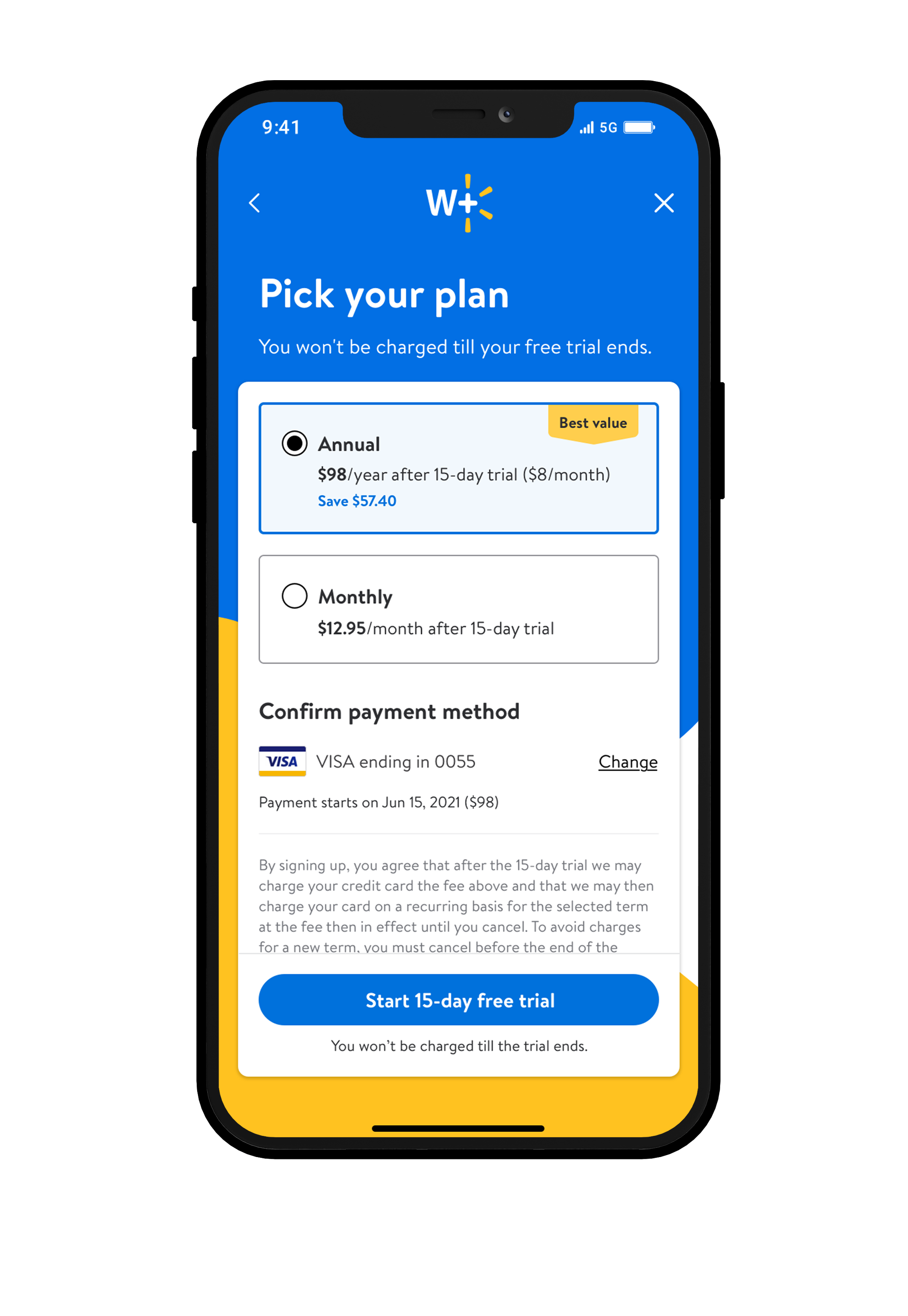
Plan selection
To increase the retention rate, the annual plan has been put as the first and default plan. It is also marked as ‘best value’ to draw customers’ attention.
To build trust and tell customers that they are signing up for a trial and don’t need to pay at this moment, the payment due date and amount were added with the card information.
Step 4
Confirmation
After signup, customers will go to the home page with another welcome message to encourage them to start shopping, or explore other Walmart+ benefits.
Iteration
New feature
Quick survey to extend the trial
This optional survey is designed to learn customers’ shopping habits. By answering three questions, customers will get 15 more days to their free trial.
Validation
Through a usability test on the Walmart sign up flow prototype, we learned:
Participants expected benefit titles on the trial sign-up page to be clickable for more information.
Opportunity: empower customers to learn more about the benefits from this page.Participants found the address eligibility flow to be intuitive and were delighted by the trial extension offer.
Opportunity: leverage the eligibility check for other benefits.Participants expected to be “sold more” on Walmart+ after the eligibility check.
Opportunity: re-engage customers ineligible for delivery with more information about other benefits.Participants are intrigued by the savings display and the dashboard, and the benefits tab exceeded their expectations.
Opportunity: land participants on the benefits tab in the hub sooner in the flow to promote benefit usage.


